top of page

Design Project / myPlan
Redesigning Course Registration for UW Students
Scope
Course Registration
Overview
MyPlan is UW’s course planning and registration tool, but students often struggle with finding classes, understanding requirements, and managing schedule changes. This redesign focused on making registration easier by improving search, filtering, requirement-based enrollment, and swap features so students can plan with more confidence.
Music
Role
Product & UX Design
Platform
Mobile/Web App
Timeline
2025
Course registration feels confusing and scattered.
Problem Statement
Students using MyPlan often have to jump between requirements, course details, schedules, and registration steps just to build a workable plan. Important actions like finding classes, swapping sections, or understanding what counts toward requirements are not always clear. This redesign focuses on making the process easier, faster, and more guided so students can register with more confidence.

Vision
A clearer way to plan and register for classes.
MyPlan was redesigned to help students move through course planning with less confusion. The goal was to make it easier to search for classes, understand requirements, compare options, and adjust schedules without feeling like the process is scattered across different steps.
Target Users
Designed for students navigating registration.
This redesign is for students who use MyPlan to search for classes, check requirements, and build their schedules. The goal is to make registration feel clearer, faster, and easier to manage.

Balancing complex information with usability.
Constraints
MyPlan had to support a lot of student needs at once: course search, degree requirements, schedule planning, registration, and last-minute changes. The challenge was making those tools feel connected without adding more clutter or making the process harder to follow.
The Starting Point
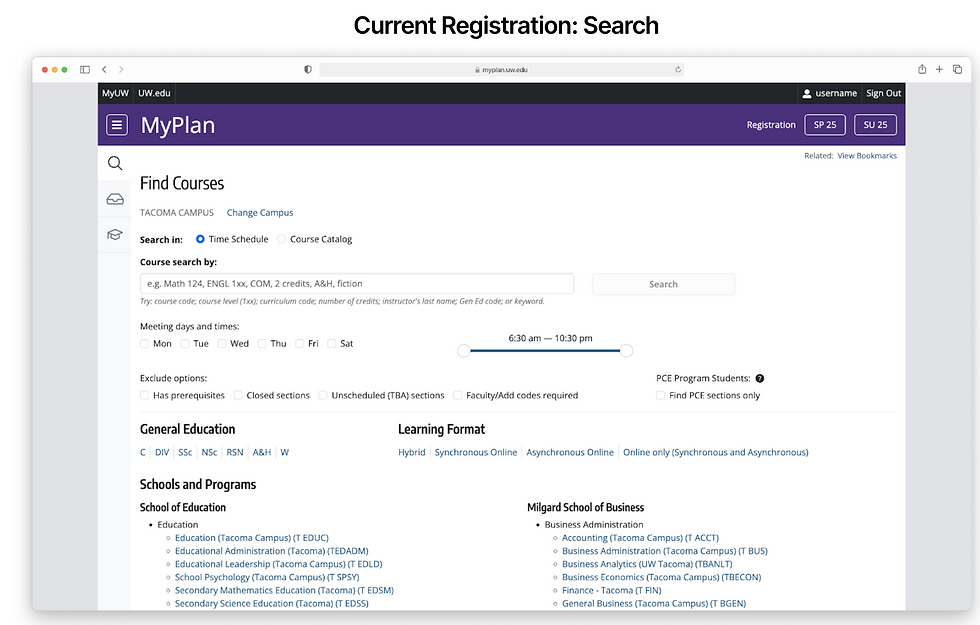
The registration system had useful tools, but they were hard to find.
Before redesigning the experience, we looked at the existing MyPlan and registration screens to understand where students might get stuck. The tools were already there, but actions like searching, filtering, dropping classes, and planning around requirements were not always easy to notice or understand.



Process / Early Prototype
From early prototype to tested design
Before reaching the final version, our team created an early prototype that explored course preview, search, enroll by requirements, and swap classes. This gave us a starting point to test how students moved through the registration flow.
Usability Testing Findings
What tested version revealed
Testing showed that some students took a while to notice the Enroll by Requirement button, clicked around before finding the favorites dropdown, had trouble understanding the filter icon, and felt that Swap Classes being separate from Drop Classes was confusing. Students also suggested that sidebar buttons could be reordered, removed, or renamed based on what they used most.

Making Existing Registration Tools Easier to Find
Design Decisions
A major part of the feedback redesign was improving the visibility and organization of key registration tools. Instead of adding more features, the focus was on making existing actions easier to notice, understand, and use. Search, filters, favorites, enroll by requirement, swap, and drop actions were redesigned around how students actually move through registration.
Final Prototype
A clearer registration dashboard
The final prototype brought the main registration tools into one more organized space. Students could view their course preview, registration status, backup classes, credit progress, and requirement information without jumping between as many separate pages. The goal was to make MyPlan feel easier to scan and more connected during registration.


© 2026 Angel Vargas Campos
No part of this site may be reproduced, distributed, or used without prior written permission
bottom of page